
Web Brand Guide
Colours, typography, and UI components for CanFASD web properties. All values are WCAG 2.2 Level AA compliant.
Primary Colours
Link Colours
Light background links — for all standard body text and light message boxes.
--link-hover · #C69214
--link-hover · #C69214
--link-hover · #C69214
--link-hover · #C69214
Dark background links — for use within header sections and hero panels.
--gold-light · #E8C96A
--gold · #C69214
--gold-light · #E8C96A
--gold · #C69214
--white · #FFFFFF
--gold-light · #E8C96A
--white · #FFFFFF
--gold-light · #E8C96A
Colour matched links — for messages, warnings, and alerts.
--info-text · #003D5C
--success-text · #1A4D30
--gold-dark · #5D4200
--danger-dark · #6B0011
Light background headings — for use on all standard pages and headings, no underline.
--gold · #C69214
--gold · #C69214
--gold · #C69214
--gold · #C69214
Dark background headings — for use within navy and burgundy hero panels, no underline.
--gold · #C69214
--gold-light · #E8C96A
--lt-grey · #EDEDED
--gold · #C69214
--gold · #C69214
--white · #FFFFFF
--gold · #C69214
--white · #FFFFFF
Auxiliary Colours
Accessible gold
Alert / Danger
Info
Neutral
Success
Warning
Captions and Highlights
Caption
Highlight
1. Colour
1.1 Brand Foundation
- Start with the core brand colours: navy for primary structure, burgundy for clinical/provider emphasis, web blue for neutral navigation surfaces, and goldenrod for accent, focus, and selected states.
- Map every colour decision to an existing CSS custom property before introducing a new value.
1.2 Goldenrod Usage
- Use goldenrod
#C69214as text only on dark navy surfaces, where it passes contrast. On light surfaces, use accessible gold text#7A5C00or#5A4400. - Use raw goldenrod
#C69214on light surfaces only as an accent border, icon fill, focus ring, or selected-state marker, and pair it with a text label when it carries meaning. - Use lighter goldenrod
#E8C96Aon burgundy dark surfaces for better readability and consistency with dark typography standards.
1.3 Functional Colour Pairs
- Keep functional colour systems together: info, success, warning, alert, and neutral each require their tint, border, and text tokens to stay paired.
- Use caption, placeholder, disabled, and body-text greys only for their named roles; do not promote disabled text or placeholder grey to required content.
1.4 Highlights
- Use highlight colours semantically: yellow is temporary search-match highlighting; blue is persistent defined-term highlighting.
- Use darker hover fills for highlight examples without adding outlines around the marked text.
2. Typography
2.1 Font Roles
- Use Century Gothic for headings and Lato for body text on web. Calibri and Garamond are print/Office fonts only.
- Set type hierarchy by role: H1 for page titles, H2 for major sections, H3 for subsections, H4 for compact card titles, body for reading text, caption/meta for supporting information.
- Map each type and text-colour decision to the documented CSS custom properties before adding new text styles.
2.2 Dark Panel Typography
- Use dark gradient panels for hero sections, callout blocks, vision/mission statements, and prominent navigation cards. Pair them with the dark-panel tokens instead of ad hoc opacity values.
- Use dark-panel text in this order: eyebrow
#C69214, main heading#FFFFFF, bodyrgba(255,255,255,0.88), subtitle#C8D8E0, and metargba(255,255,255,0.5)for decorative support only. - Use
#E8C96Arather than raw goldenrod for gold text on burgundy panels.
2.3 Links and Text Indicators
- Use standard body links with underline. Use no-underline interaction only in navigation, buttons, meta chips, and card actions where border, hover, focus, and/or bold states supply the interaction cue.
- Use the external-link arrow as text, not an icon glyph, and only on links that leave the current site or open an external resource.
2.4 Search and Term Highlights
- Use
highlight-searchonly for temporary JavaScript search matches. Remove it when the search query clears. - Use
highlight-termonly for defined terms or glossary concepts, and pair it with a definition, tooltip, or nearby explanatory context. - Use
<strong>for emphasis; do not use highlight styles for decorative emphasis.
3. Components
3.1 Interaction Basics
- Start with semantic structure: use real buttons for actions, real links for navigation, and appropriate headings, lists, tables, and landmarks.
- Keep all interactive buttons at or above 44 px height. Adjust padding or wrapping rather than reducing the target size.
- Use the global focus style: 3 px goldenrod outline plus white offset halo. Do not remove it for custom buttons, tabs, cards, or form controls.
- Use body-link underlines in prose. Use hover/bold/border states instead of underline only for navigation menus, tabs, chips, button-like links, and card action rows.
3.2 Badges, Tags, and Chips
- Use pills for compact status/category metadata, tags for card and directory metadata, and meta chips for dark-surface system metadata only.
- Keep filled and outlined pills/tags the same size, and use inverse hover states without layout shift.
3.3 Icons
- Use semantic icons without square backgrounds only when the shape itself carries meaning, such as warning, map, route, home, clinic, or accessibility marks.
- Use squared icons for general UI actions and objects that do not have a strong semantic silhouette. Keep white icons on dark fills unless a documented semantic colourway applies.
- Use large round/expanded icons for feature navigation, section headings, and splash surfaces; keep their hover motion on the full icon treatment rather than moving the glyph alone.
3.4 Cards and Messages
- Use content-card accent borders consistently: navy = featured/resource, info = information/assessment, success = confirmed/submitted, gold = note/eligibility, danger = alert/declined, neutral = default/non-semantic.
- Use message cards for inline status and guidance. Keep the icon aligned with the title/body text, place action links below a divider, and use matching hover borders for the non-left sides.
3.5 Editorial Blocks and Demos
- Use block quotes with a cited source. Use the inline quote for body content and dark featured quotes for prominent editorial moments only.
- Keep the guide self-contained: examples must use brand-guide scoped classes or inline demo styles so live site component changes do not distort the reference.
4. Colour
| Colour | Hex | Contrast | Notes |
|---|---|---|---|
| Navy | #002A3A | 18.3:1 on white ✓ | Any size text |
| Burgundy | #643335 | 7.8:1 on white ✓ | Any size text |
| Web blue | #303E4E | 10.7:1 on white ✓ | Any size text |
| Goldenrod | #C69214 | 2.9:1 on white ✗ 6.3:1 on #002A3A ✓ |
Fails text use on light backgrounds. Use accessible gold text on white. Raw goldenrod is for dark surfaces, accents, focus, selected markers, and labelled non-text accents. |
| Light grey | #EDEDED | Navy text: 15.2:1 ✓ Burgundy text: 6.4:1 ✓ |
Background surface — navy or burgundy text both pass on this surface |
| Dark grey | #3F3F3F | 10.0:1 on white ✓ | Any size text — primary body copy colour |
| Gold (accessible) | #7A5C00 | 5.0:1 on white ✓ | Any size text — use instead of #C69214 for text on light backgrounds |
| Mid grey | #595959 | 7.0:1 on white ✓ | Captions and secondary text — use instead of #888 for small text |
| Functional colour pairs — text on tinted background | |||
| Aa Info text | #003D5C on #E8F3F8 | 8.2:1 ✓ | Any size text on info background |
| Aa Success text | #1A4D30 on #E8F5EE | 8.9:1 ✓ | Any size text on success background |
| Aa Warning text | #5D4200 on #FEF8E6 | 9.4:1 ✓ | Any size text on warning background |
| Aa Alert text | #6B0011 on #FDECEA | 9.1:1 ✓ | Any size text on alert background |
| Aa Neutral text | #1F2D3A on #F0F4F6 | 14.2:1 ✓ | Any size text on neutral background |
| Link colour states — on white | |||
| Link hover | #4A2426 | 10.8:1 ✓ | Any size text |
| Link visited | #643335 | 7.8:1 ✓ | Any size text — burgundy |
| hover | #C69214 | 3.0:1 | Hover accent only. Do not use as standalone body text on white. |
| UI / form colours | |||
| Placeholder | #767676 | 4.5:1 on white ✓ | Borderline AA — do not use for required content or labels |
| Disabled text | #949494 | 3.0:1 on white ✗ | Intentional — SC 1.4.3 exempts inactive UI components. Large text only. |
| Non-text contrast & focus — SC 1.4.11 / SC 2.4.11 | |||
| Goldenrod borders / icons | #C69214 | 2.9:1 on white ✗ 6.3:1 on #002A3A ✓ |
SC 1.4.11 requires 3:1 for meaningful icons and borders. Goldenrod on white falls short — supplement with a visible text label, use the darker gold text token, or place goldenrod on navy. |
| Focus ring (gold outline) | #C69214 + white halo | Passes SC 2.4.11 ✓ | 3px gold outline + 5px white offset halo. The halo separates the ring from component backgrounds; gold ring contrasts against the white halo (inferable). Meets SC 2.4.11 focus appearance. |
5. Typography
| Element | Hex | Contrast | Notes |
|---|---|---|---|
| Heading colours — on white · SC 1.4.3 | |||
| H1 / H2 | #002A3A | 15.1:1 on white ✓ | Navy — any size text |
| H3 / H4 | #643335 | 10.2:1 on white ✓ | Burgundy — any size text |
| Body text colours — on white · SC 1.4.3 | |||
| Body paragraph | #3F3F3F | 10.5:1 ✓ | Dark grey — any size text |
| Caption / secondary | #595959 | 7.0:1 ✓ | Mid grey — any size text |
| Placeholder | #767676 | 4.5:1 ✓ | Borderline AA — do not use for required content or labels |
| Link colours — on white · SC 1.4.1 / SC 1.4.3 | |||
| Body link | #005B8E | 7.3:1 ✓ | Info blue — standard prose links are underlined; colour is not the sole identifier |
| Visited link | #643335 | 7.8:1 ✓ | Burgundy — distinguishable from unvisited link colour ✓ |
| Text highlights — text on accent background · SC 1.4.3 | |||
| Search highlight text | #3F3F3F on #FFF4CC | 9.6:1 ✓ | Dark grey on gold tint — any size text |
| Term highlight text | #003D5C on #E8F3F8 | 10.2:1 ✓ | Dark info-text on light info-bg — any size text |
| Text requirements — SC 1.4.1 / SC 1.4.4 / SC 1.4.12 | |||
| Link identification | SC 1.4.1 | Passes ✓ | Body-copy links use underline. Navigation, chips, buttons, and card actions use border, hover, focus, icon, or weight changes as their non-colour cues. |
| Text resize | SC 1.4.4 | Passes ✓ | Layout holds at 200% zoom — no content clipping or horizontal scroll. |
| Text spacing | SC 1.4.12 | Passes ✓ | Line height ≥ 1.5×, letter spacing ≥ 0.12em, word spacing ≥ 0.16em — overrides respected without loss of content. |
6. Components
| Component | Token / Value | Result | Notes |
|---|---|---|---|
| Button target size — SC 2.5.8 (WCAG 2.2) | |||
| All buttons | min-height: 44px | Passes ✓ | All interactive button variants meet the 24×24 px minimum and target the 44 px recommended size. |
| Focus appearance — SC 2.4.11 (WCAG 2.2) | |||
| Focus ring | #C69214 + white halo | Passes ✓ | 3 px gold outline + 5 px white offset. Halo ensures the ring contrasts against any component background. Meets minimum area and contrast requirements of SC 2.4.11. |
| Non-text contrast — SC 1.4.11 | |||
| Icon backgrounds (white icon) | #fff on dark fill | ≥ 4.5:1 ✓ | Squared and round icon fills using navy, burgundy, info, success, danger, neutral, or web blue exceed the 3:1 non-text contrast minimum with white or documented foreground colours. |
| Goldenrod borders on white | #C69214 on white | 2.9:1 ✗ | Falls below the 3:1 SC 1.4.11 minimum for informational icons and borders. Supplement with a text label, or use on a navy background where it passes at 5.4:1. |
| Link identification & contrast — SC 1.4.1 / SC 1.4.3 | |||
| Body link | #005B8E on white | 7.3:1 ✓ | Standard prose link: underlined by default, so colour is not the sole link identifier (SC 1.4.1 ✓). Any size text. |
| Visited link | #643335 on white | 7.8:1 ✓ | Burgundy visited state is visually distinct from unvisited link colour. Standard prose links remain underlined. |
| Link on dark background | #C69214 on #002A3A | 5.4:1 ✓ | Goldenrod on navy passes for text. Use underline for prose links; use border/weight/focus states for button-like dark-surface navigation. |
| Component requirements — SC 1.4.1 / SC 2.5.8 / SC 2.4.11 | |||
| Link identification | SC 1.4.1 | Passes ✓ | Body links use underline. Navigation links, meta chips, and card actions use non-colour cues such as borders, weight, icons, hover background, focus ring, or held selected state. |
| Button target size | SC 2.5.8 | Passes ✓ | All interactive buttons are min 44 px tall. Inline text links are exempt under the SC 2.5.8 inline exception. |
| Focus appearance | SC 2.4.11 | Passes ✓ | 3 px outline + 5 px white offset halo. Meets the minimum enclosed area (CSS outline with offset qualifies) and contrast requirements of WCAG 2.2 SC 2.4.11. |
| Navigation states | hover + border + weight | Passes ✓ | Main tabs, dropdown menus, hub sidebar links, and topics sidebar links avoid underline but provide non-colour cues through held selected state, borders, background change, and bold text. |
| Badges and tags | pre-paired tokens | Passes ✓ | Outlined and filled pills/tags use documented foreground/background pairs. Filled states invert to outlined on hover without changing dimensions. |
| Content cards and messages | semantic tint + border | Passes ✓ | Cards and messages pair semantic tint, left accent border, heading text, and footer/action rows. Meaning is not conveyed by colour alone. |
| Highlights | search / term | Passes ✓ | Search highlights and term highlights use different tints and darker hover fills. Their semantic purpose is documented in text, not inferred from colour alone. |
Typefaces
--serif: 'Century Gothic', 'Futura', 'Trebuchet MS', 'Lato', Arial, sans-serif
--sans: 'Lato', Arial, Helvetica, sans-serif
NOTE: All listed serif and sans fonts are required as fallback options for brand cohesion across different operating systems.
Type Scale
| Level | Specimen | Size | Weight | Colour | Hex |
|---|---|---|---|---|---|
| H1 | Page title | 2rem | 700 | --navy | #002A3A |
| H2 | Section heading | 1.5rem | 700 | --navy | #002A3A |
| H3 | Sub-heading | 1.25rem | 700 | --navy | #002A3A |
| H4 | Card title | 1.125rem | 700 | --navy | #002A3A |
| Body | Body paragraph text | 1rem | 400 | --dk-grey | #3F3F3F |
| Caption | Small caption text | 0.875rem | 400 | --caption | #595959 |
| Eyebrow | Canada FASD Research Network | 0.875rem | 700 | --gold-safe | #7A5C00 |
| Section label | Resources | 0.8125rem | 700 | --neutral | #3F3F3F |
| Meta | Last revised May 11, 2026 | 0.825rem | 400 | --caption | #595959 |
Interactive Elements
Badges, tags and meta chips — compact labels for categories, statuses and dark-surface metadata.
Pills
Tags
Navy chips
Burgundy chips
Callouts and Quotes
Body pull quote
The most effective tool is [to] have the time to listen … just sit and listen. … For too many, this is the first time their story has been shared with anyone.
Featured / hero pull quote
"FASD is a lifelong disability. With the right supports, individuals with FASD can thrive in their communities."
"The most effective responses are grounded in relationships, dignity, and practical supports that meet people where they are."
Content Cards
Background tint
Combined with an accent border for stronger semantic signal.
Featured
CanFASD Research Digest
Monthly summaries of the latest FASD research, curated for practitioners and policymakers.
Information
What is an FASD Assessment?
A multidisciplinary assessment evaluates an individual across ten neurodevelopmental domains using standardized measures.
Confirmed
Referral Submitted
Your referral has been received. A clinic coordinator will contact you within 5–10 business days to discuss next steps.
Note
Eligibility May Vary
Referral pathways differ by clinic, province, and age group. Confirm current criteria directly with the clinic before submitting.
Alert
Referral Declined
Your referral could not be processed. Contact the clinic coordinator for more information or to resubmit.
Neutral
Alberta
Alberta has 3 diagnostic clinics and 12 FASD support network service providers across the province.
Messages
Inline status messages and contextual callouts for communicating success, warnings, errors, or guidance alongside content.
FASD resources for health and allied health care providers.
Your referral has been submitted successfully.
Contact the clinic directly to confirm eligibility.
This clinic is not currently accepting referrals.
Visit the Patient and Family-Facing Resources section for more.
Tabs
Underline
Underline neutral
tabs-light--underline-neutralUnderline gold
tabs-light--underline-goldRounded
Rounded neutral
tabs-light--rounded-neutralHighlights
Search results
Live example — search highlight
There is currently not a standardized, validated identification tool for FASD, although the diagnostic criteria — facial features, significant brain domain impairment, and prenatal alcohol exposure — are well-established.
Key terms
Live example — term highlight
There is currently not a standardized, validated identification tool for FASD, although the diagnostic criteria — facial features, significant brain domain impairment, and prenatal alcohol exposure — are well-established.
Side-by-side comparison
7. CSS variables
7.1 CanFASD tokens
/* CanFASD Web Brand Tokens */
:root {

  /* ── Core brand ── */
  --navy:        #002A3A;
  --burgundy:    #643335;
  --gold:        #C69214;
  --gold-safe:   #7a5c00;
  --web-blue:    #303e4e;
  --lt-grey:     #EDEDED;
  --dk-grey:     #3F3F3F;

  /* ── Link ── */
  --link:               #005B8E; /* 7.3:1 on white ✓ */
  --link-hover:         #C69214;
  --link-visited:       #643335;
  --link-visited-hover: #C69214;
  --link-dark:          #C69214;
  --link-dark-white:    #FFFFFF;
  --link-dark-hover:    #E8C96A;
  --link-dark-hover-gold: #C69214;

  /* ── Info ── */
  --info:          #006494;
  --info-hover:    #004d70;
  --info-bg:       #E8F3F8;
  --info-bg-mid:   #cce4f0;
  --info-border:   #b5d4f4;
  --info-text:     #003D5C;

  /* ── Success ── */
  --success:          #2A7A4B;
  --success-hover:    #1f5c38;
  --success-bg:       #E8F5EE;
  --success-bg-mid:   #c8ebd6;
  --success-border:   #a3cfb6;
  --success-text:     #1A4D30;

  /* ── Warning ── */
  --warn-bg:        #FEF8E6;
  --warn-bg-mid:    #fde99c;
  --warn-border:    #e8c96a;
  --warn-text:      #5D4200;
  --warn-text-dark: #3d2b00;

  /* ── Alert / Danger ── */
  --danger:         #A8001A;
  --danger-hover:   #7d0013;
  --danger-bg:      #FDECEA;
  --danger-bg-mid:  #fac9cc;
  --danger-border:  #f5c2c7;
  --danger-text:    #6B0011;

  /* ── Neutral ── */
  --surface:          #fafbfc;
  --neutral-bg:       #F0F4F6;
  --neutral-bg-mid:   #dce4ea;
  --border:           #d0d7de;
  --neutral-mid:      #8fa3b0;
  --neutral-text:     #1F2D3A;

  /* ── Highlight ── */
  --hl:            #FFF4CC;
  --hl-mid:        #fde99c;
  --hl-border:     #e8c96a;
  --hl-term-bg:    #E8F3F8;
  --hl-term-mid:   #cce4f0;
  --hl-selection:  #b5d4f4;

  /* ── Accessible gold ── */
  --gold-safe-hover: #5a4400;
  --gold-tint:       #FEF8E6;
  --gold-tint-mid:   #fde99c;
  --gold-border:     #e8c96a;

  /* ── Caption / UI text ── */
  --caption:       #595959;
  --placeholder:   #767676;
  --disabled-text: #949494;

  /* ── Typography ── */
  --sans:  'Lato', Arial, Helvetica, sans-serif;
  --serif: 'Century Gothic', 'Futura', 'Trebuchet MS', 'Lato', Arial, sans-serif;
}
8. Font stack
8.1 Google Fonts
<link rel="preconnect" href="https://fonts.googleapis.com">
<link rel="preconnect" href="https://fonts.gstatic.com" crossorigin>
<link href="https://fonts.googleapis.com/css2?family=Lato:ital,wght@0,400;0,700;1,400&display=swap" rel="stylesheet">
Source brand
The following is drawn directly from the official CanFASD Branding Document. This web guide operationalizes these values for digital/screen contexts.
Brand story
Vision
All Canadians are engaged and united with awareness, evidence and knowledge and are effectively addressing the complexities of FASD.
Mission
CanFASD supports Canada's families, caregivers, individuals with FASD, practitioners and leadership across all sectors and at all levels, in addressing the extraordinary complexities of FASD. The Network does this through facilitating and sustaining a national research collaborative focused on the domains of FASD prevention, intervention and diagnosis, and by disseminating research-based knowledge about FASD to those who need it.
Values
- Undertake, coordinate and facilitate research that is meaningful and applicable to families, governments, service providers and stakeholders
- CanFASD works collaboratively with partners and stakeholders
- Use appropriate language when communicating about FASD, recognizing the sensitivities and complexities of FASD
- CanFASD recognizes and values the critical importance that research contributes to informing policy and program development and delivery
- CanFASD engages Canada's diverse cultural groups as partners in working to achieve the vision and goals of the Network
Source colours
Colours as specified in the official brand document, including CMYK and RGB values for print production.
CMYK 100, 47, 22, 82
CMYK 30, 85, 59, 70
CMYK 6, 35, 99, 18
CMYK 82, 65, 46, 45
CMYK 8, 6, 7, 0
CMYK 47, 38, 36, 17
CMYK 68, 61, 60, 48
Source typography
Primary typefaces
Century Gothic
Headings, accent text, social graphics. Chosen for a modern, approachable appearance.
Lato — Web Font
Official CanFASD web font. Used for all body text on digital properties.
Print / Office typefaces
Calibri
Modern and approachable. For large text bodies — issue papers, PowerPoint. Minimum 10 pt.
Garamond
Classic and established. For printed documents — letters to government, progress reports. Minimum 11 pt.
Logo usage guidelines
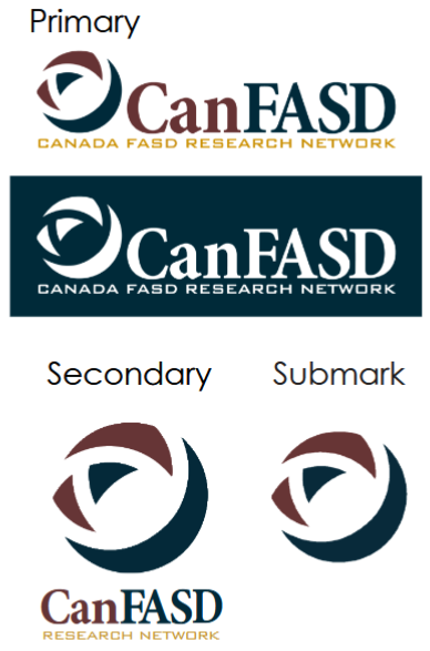
Primary logo rules
- Primary option is always the tri-coloured logo
- Maintain proportions when resizing — never stretch or distort
- Minimum print size: 3.5 cm × 1.12 cm
- Do not add effects (outlines, shadows, filters)
- Do not place over a busy image — text must remain legible
- Do not rotate the logo
- Always maintain buffer space (clear space) around the logo
- Use all-white full logo on dark backgrounds
When to use alternatives
- Secondary logo — only when the full logo does not fit, e.g. alongside other organizations' logos
- Submark — subsequent pages where the full logo already appears; social media profiles; document icons
Brand buzzwords
Core vocabulary for CanFASD communications, campaigns and messaging.